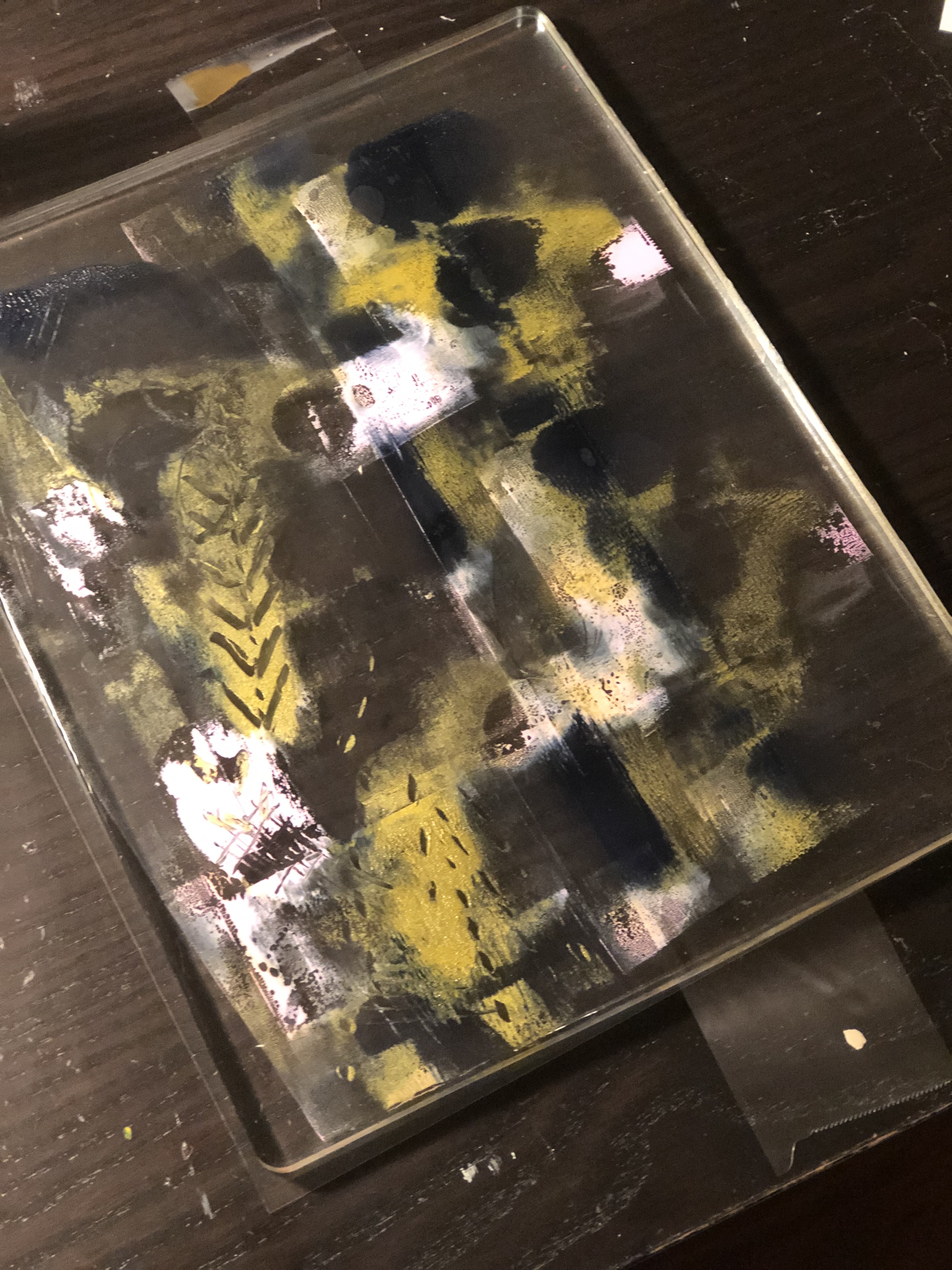
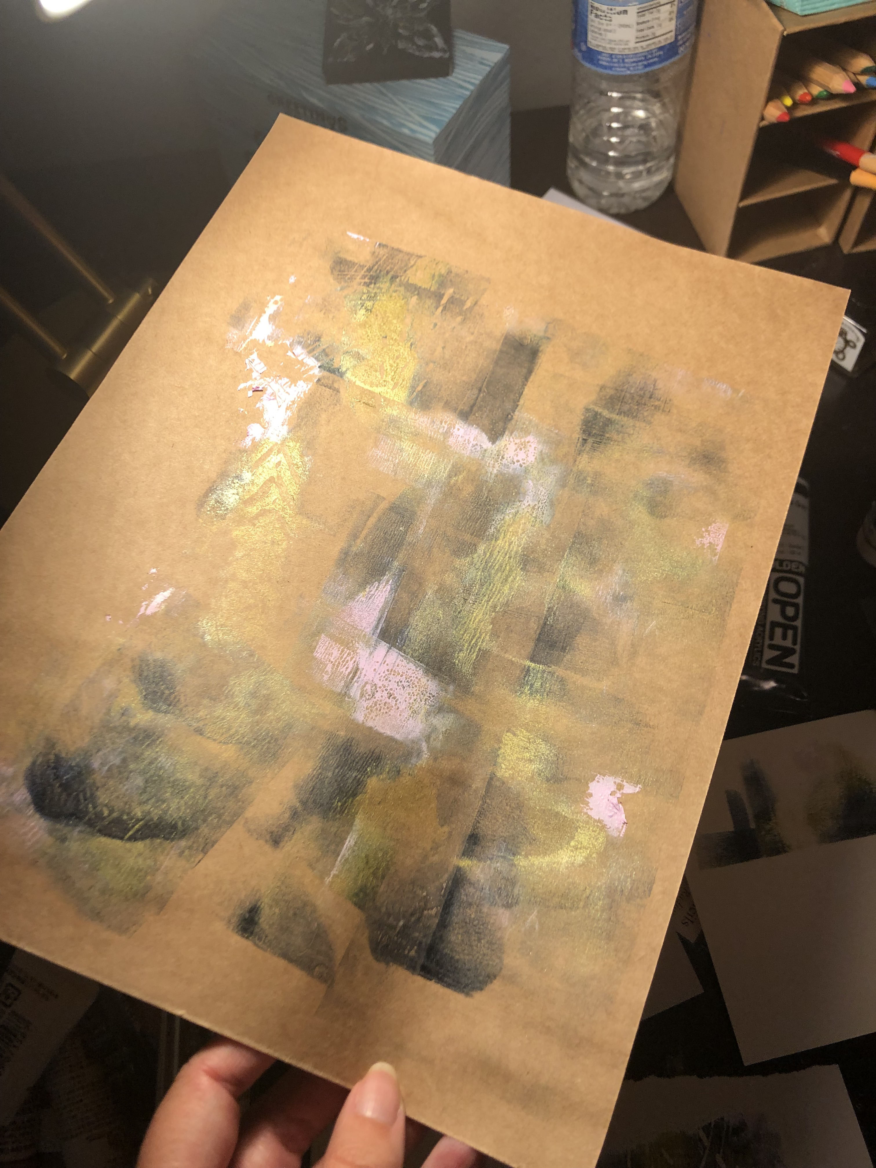
I really enjoy these plexiglass prints, because it’s a great exercise in letting go and getting into the process without worrying about the outcome. As you can see, the plate doesn’t look much like the print at all. Part of the fun is filling in the abstract shape with pastels, and even gold leaf! I purposefully don’t try and make it look like what’s on the plate. Instead, I simply go where it leads.
Usually, I get two prints from a plate like this, lightly re-inking after each one as the paint does dry quickly. (I use a mix of block printing inks and acrylics and they both work fine.)
Initially, I had planned to wash and reuse the plates, but I find that I like the effect of the paint/ink on the plexiglass. Plexiglass is pretty inexpensive, so I will just keep it as another art piece.
I’m considering opening up for sales again later this summer. These would be hard to sell as originals because the pastel powder is hard to control, thus hard to ship. But maybe I could work them into an embellished print (fine art print) series. We will see.
I love the look of stained glass, but my overflowing supply cabinet and relatively small studio space tell me now is not the time to learn a new craft! So, I tried painting on *Grafix Dura-Lar to mimic the effect for now.
I used a combination of ink and acrylicsand lined it with Pebeo relief outlinerto get more dimension and a stained glass edge effect.
I’m happy with the way it turned out, and because the Dura-Lar is more portable than a heavy window, I can move the pieces around to different windows, easily make larger pieces or switch them out for seasons, etc!
*I occasionally use affiliate links, when it’s a product I have used or personally recommend, and when it makes sense to do so.
Adobe Fresco, a relatively new painting program has a neat brush that digitally mimics that flow of watercolors. I like the final effect, and it’s fun to see the water digitally “spread” in progress. Maybe I will try and capture a video to share. In the meantime, here are a few recent digital sketches using the Adobe Fresco watercolor brush.
An upside of the social distancing we are experiencing, is that there’s not much to entertain or distract me from my studio. When things get busy, it is one of the first activities to be pushed aside, which makes no sense, because when I am in there, almost immediately, I feel relaxed and productive. I think it’s human nature, or at least American nature, to feel that if something is “fun” than it isn’t work, and if it isn’t work, than it’s not as important as work. Even though I like my actual “work,” I am not immune to that attitude.
Anyway, I’ve been wanting to work with oil paint, but my studio supplies are getting out of control and I don’t want to buy anything new until I work on that. But I have oil sticks, pigment and oil binder. So, I decided to try making my own oil paint from pigment and safflower oil, and with a little oil mixed into oil stick.
There are so many ways that creative work can bring joy and satisfaction. I love being able to experiment with raw materials to make something new. I’m self aware enough to know that I am not the world’s best artist, and that’s okay. My creative satisfaction comes from the act of creating something completely new, whether it’s a piece of art, a rubber print block that I carved and used, or mixing up paint in an new shade or finish. I enjoy breaking things down to their component parts and then rebuilding them into something useful and custom-made.
In this chaos, for me at least, it’s going to be important to look beyond the usual for validation and happiness. Everything from client acquisition and feedback to social media measurement will dip, so those things aren’t accurate metrics right now. My business, like most businesses, will just have to be what it is for a little while, but I can regain some of that validation through my creative work. While I don’t know what life will look like on the other side of this, it really does help to identify healthy and creative things that I can control, and do more of those things while the world works itself out.
There wasn’t sparkly green, antique rose gold or sheer pink iridescent oil paint in my world before I went into the studio yesterday, and now there is. I can see it, mix it, paint with it, and finish the day knowing that I built one small thing that does what it’s supposed to do.
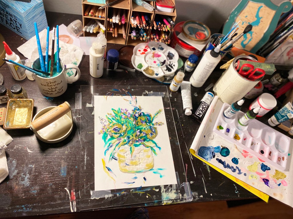
I don’t have a lot of time this week, but it’s important to commit to at least a few hours in the studio, both as a commitment to my art, and a way to make sure I prioritize something important to me. So, yesterday afternoon, I took out my Gelli plate and made some quick prints. I’m still learning this method and I really love it! It’s great for making quick pieces and having the validation of finishing something while taking my time with other things in the background.
I started with a few colors. Payne’s Gray is my all-time favorite color. I believe I have it in every medium – it’s just so versatile. Sometimes it looks blue, other times gray…it’s a good way to paint something “black” and still keep some nuance in the shade. I also used gold and a pale lilac. I use a mix of block print ink and acrylic paints, because I didn’t want to invest too much into the inks right away. As far as I know, they both work fine – I’m happy with my finished pieces, and both mediums wash easily off the plate.
Next, I take a small brayer and spread the colors. As you can see, a little goes a long way.
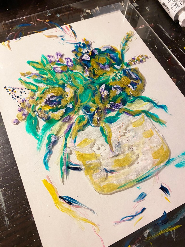
This is the first print. Pretty Straightforward.
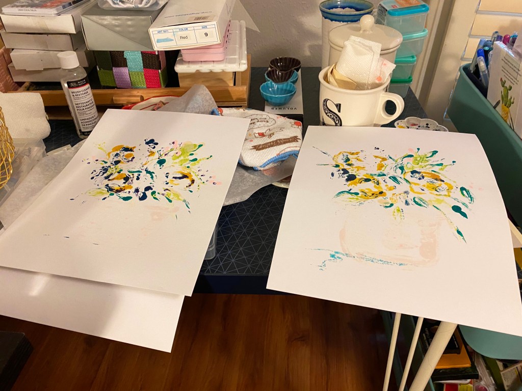
One thing I really appreciate about this type of art, is that I can make many different pieces from the same paint spreads, and each looks a little different. (I could also have done more pulls of the first print for more similarity or a series.) Nothing is wasted. Here, I’ve laid out paper of different sizes, just to see what comes out of the process.
Before I placed the paper, I scratched some designs into the color. While I am sure there are specific tools or methods for this, I just used a plain palette knife, very gently.
Pretty cool. I like how, similar to clouds or ink blots, there are a lot of things to discover in these abstract shapes.
For example, I see a lot of city scapes or even highways here. The middle two remind me of a city and mountains. Maybe because I’ve had the Pacific NW on my mind. (I live in Texas – great barbecue, no mountains haha.)
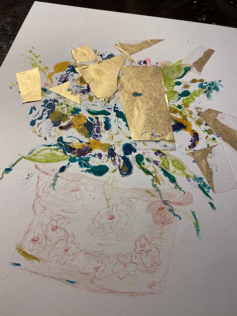
I used a white gel pen to add in the smallest of details to guide the eye into seeing what I see here.
By now, the plate is pretty faded. But there’s still enough for one more pull. I use plain craft paper for the final print each time. Eventually, there will be enough to look like a series of abstracts that would look good displayed together.
Ta-Da!
All of this, plus cleaning the plate and tidying my materials took roughly an hour. While my heart will always be in figures and more narrative work, this was a great way to spend an afternoon, and got my wheels turning on how I can start selling art again without making it a whole “big thing” as they say. Stay tuned…
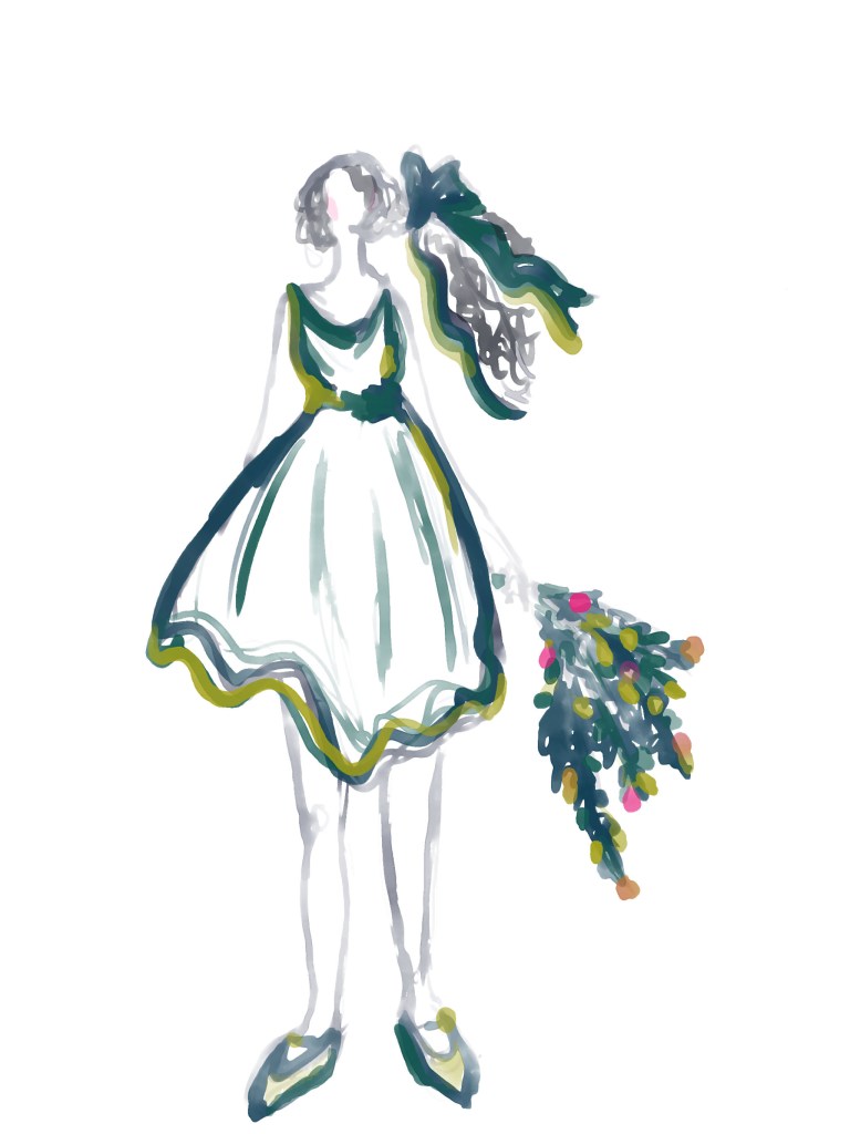
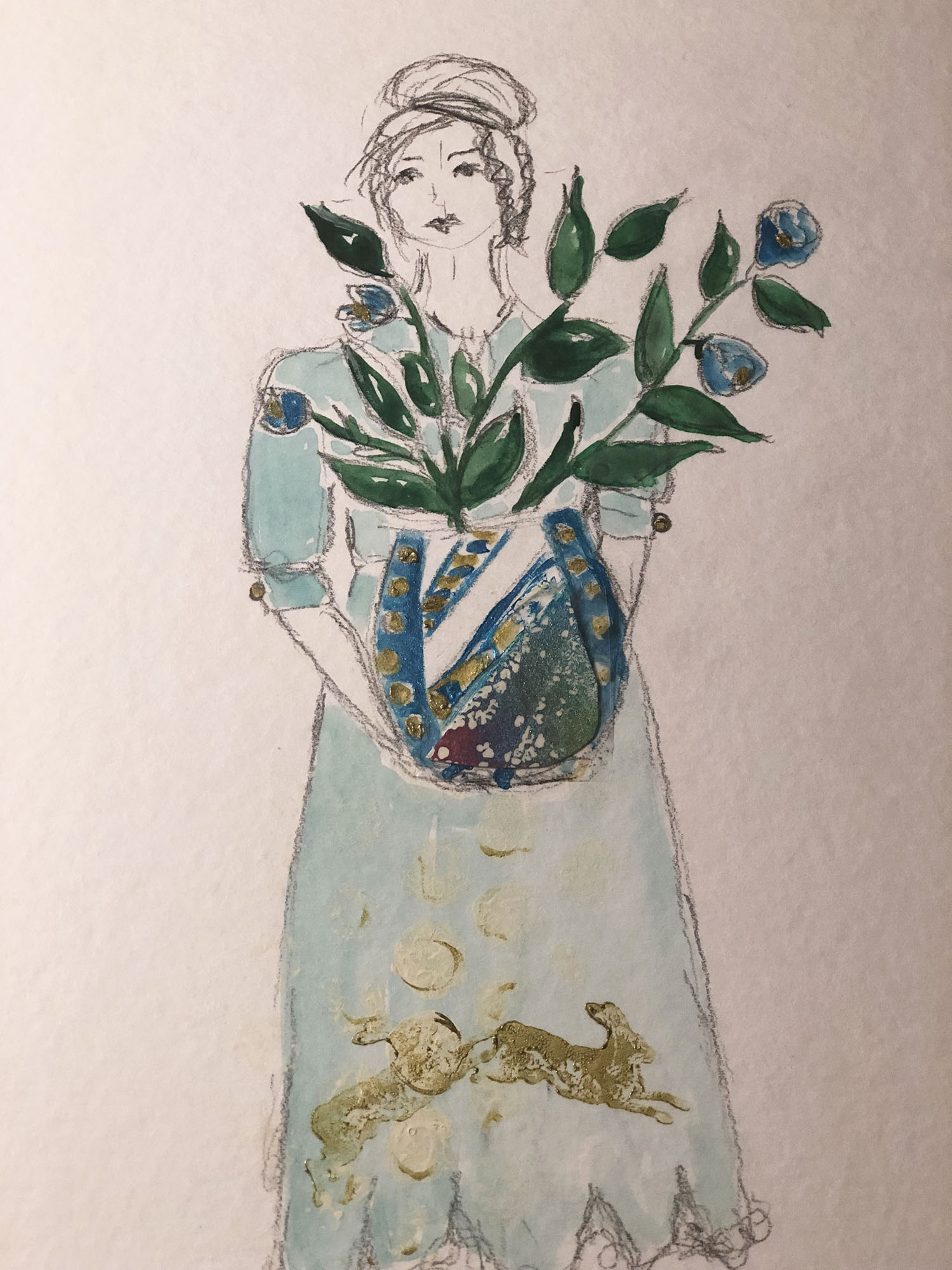
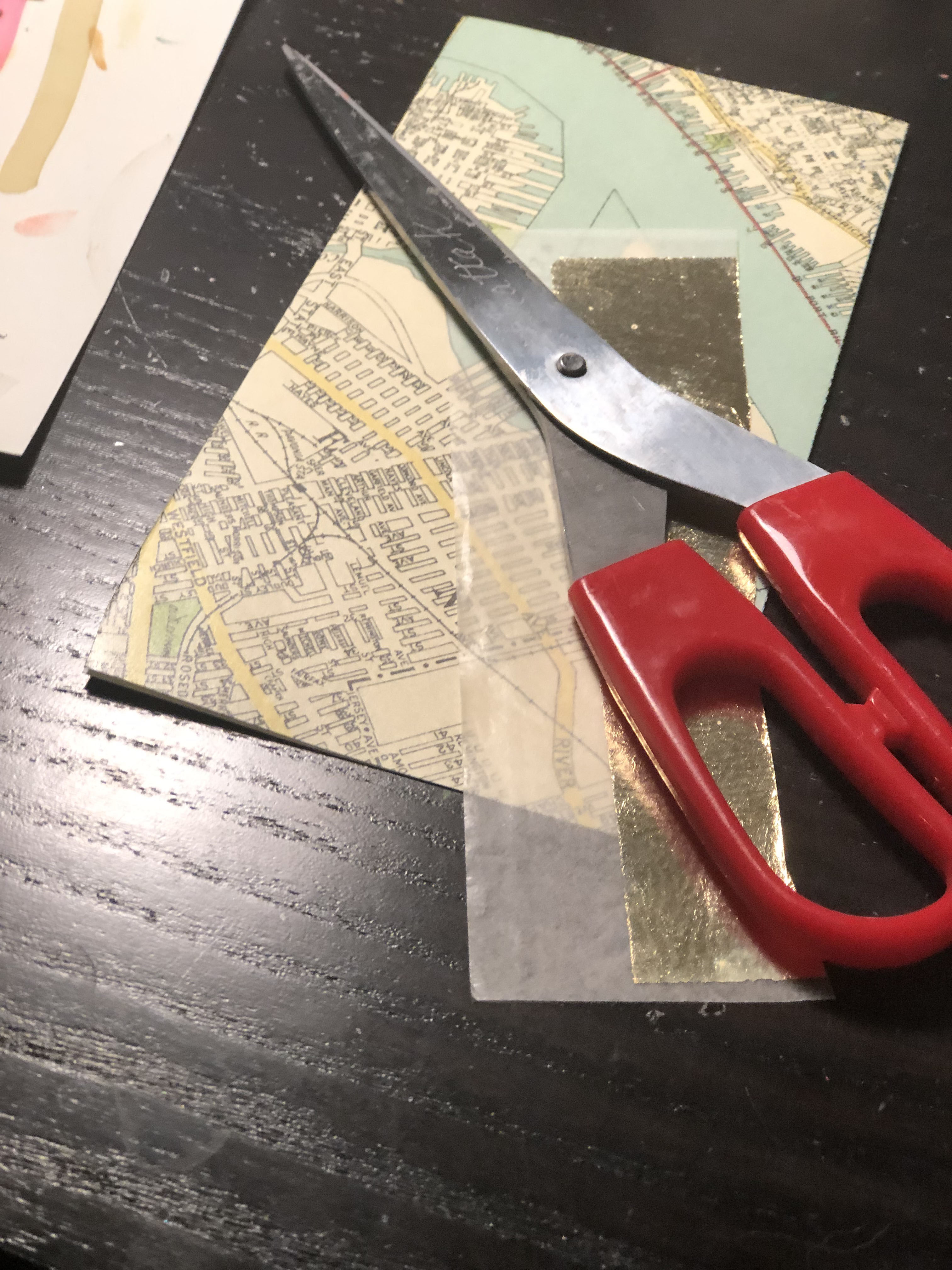
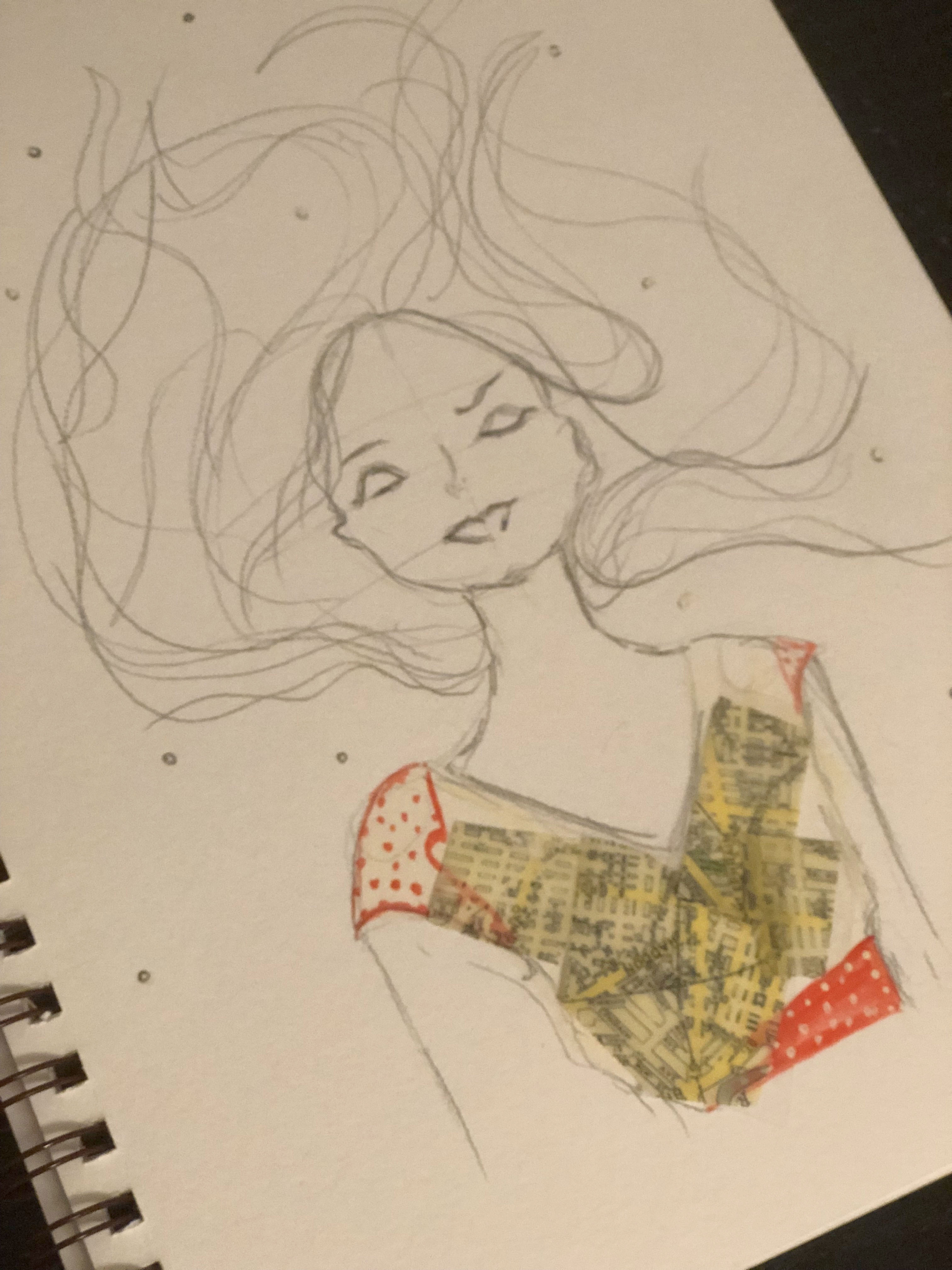
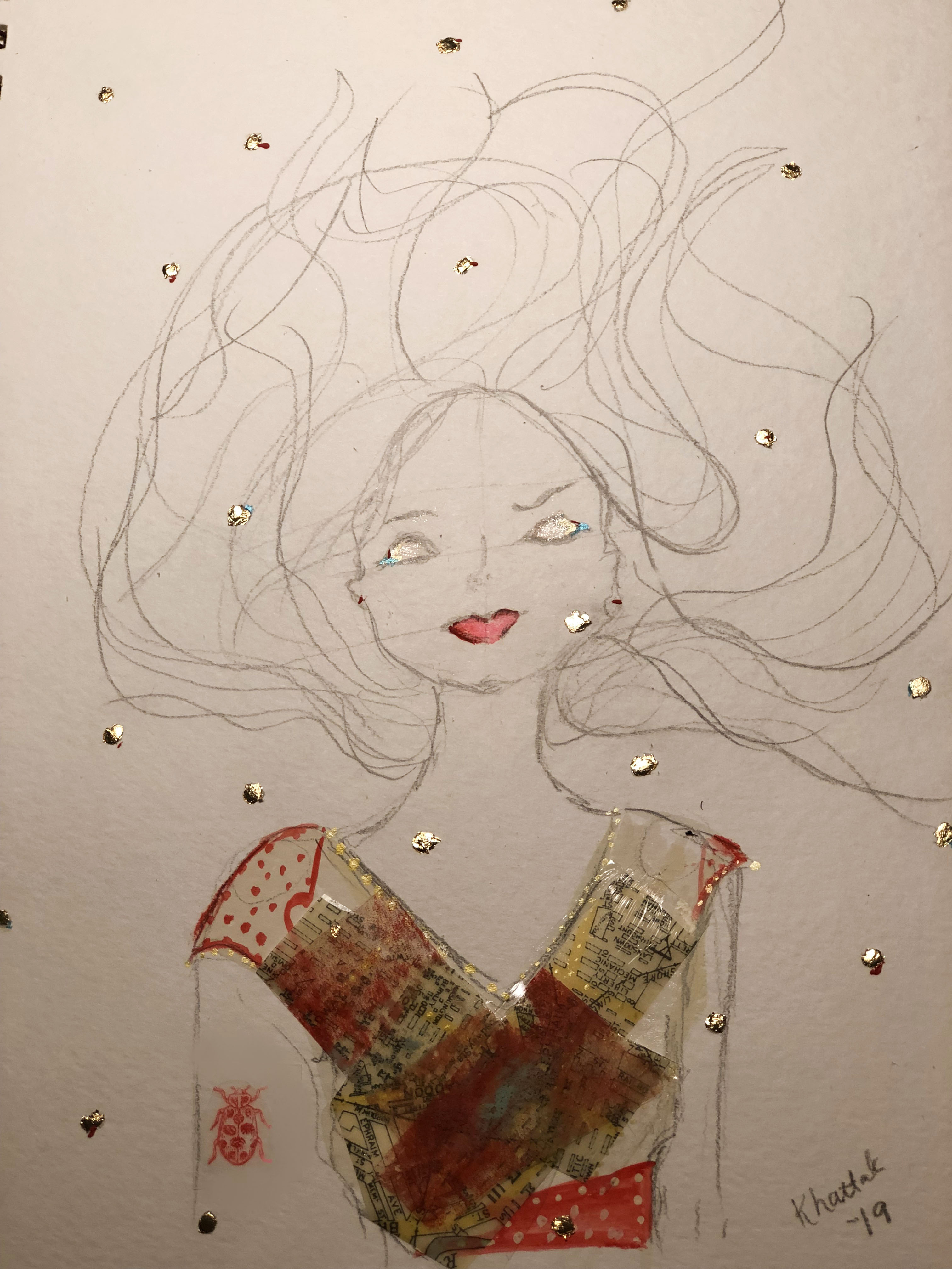
I bought a *Gelli plate and *brayer to experiment with printing techniques, and had some leftover test papers. I especially liked the way these bright rainbow colors turned out, and decided to work them into a new collage piece.
I used plain bubble wrap to make a dot texture on her skirt.
Leaping rabbits thanks to a stamp set. (TBH I’m not stoked about how the rabbits look. I think I should have used a thinner acrylic or ink vs. thicker ink. Ah well, that’s why I test and learn.)
*Affiliate links mean I may receive compensation if I recommend something you purchase. I don’t recommend products that I don’t endorse, and all content and opinions are my own.
“You have to play a long time to be able to play like yourself.” – Miles Davis
Miles Davis was a musician, but his quote can be applied to any creative endeavor. It takes a while to get the basics right before a real sense of style and individuality comes through.
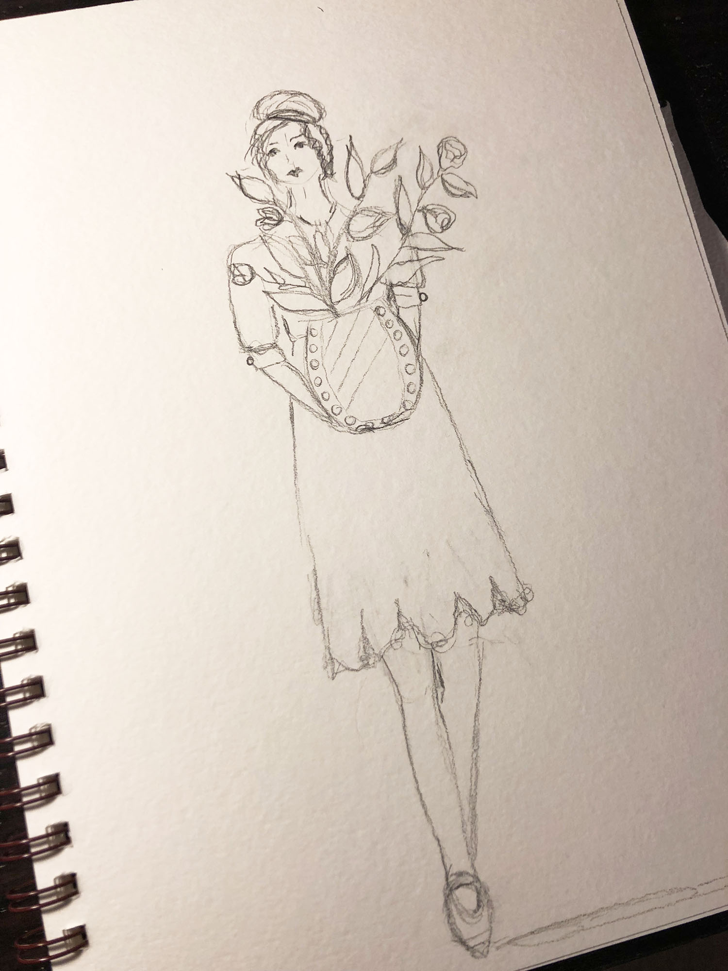
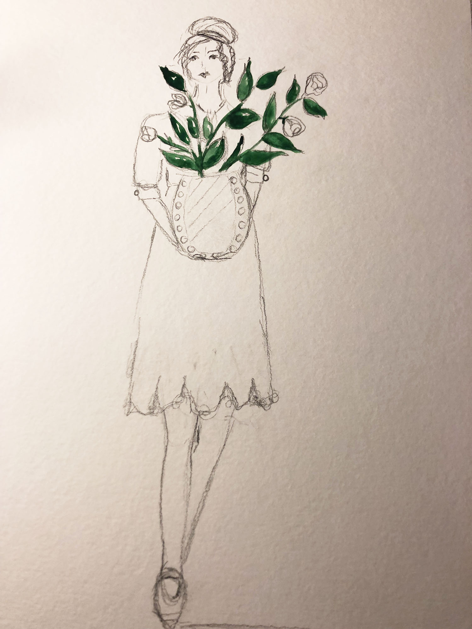
I’ve been a “practicing” artist coming up on three years in July. That seems like a long time, but I’ve needed every one of those years to evolve, first looking to others for inspiration and learning different techniques, tools and processes, and then using that knowledge to communicate my own message.
When I started writing Pine Curtain Stories, I identified a story I wanted to tell. The more I write it, the more I want to refine my art to support those stories and say exactly what I want to with the images and not just with the words. So, I’ve started taking more time with my art, both physical (time in the studio) and mental (time with my thoughts and intentions.) It makes for a longer road, but rather than being disheartening, it’s actually very exciting.
Earlier this week, I dug into my supply box and found all sorts of things I used in the beginning of this journey and hadn’t found a way to incorporate lately. I had a great time with it all, and I’m so pleased that nothing has gone to waste.
I’m incorporating more collage into my work, and I’m happy with the results. I’ve used packing tape collages, tape transfer methods and plain-old cut paper and glue/gloss gel methods to achieve the look I want. As a bonus, it’s also motivated me to find new resources, so on Friday I took myself on a field trip to Paper Arts and disappeared into its wonderful stacks for a half-hour or so.
Here’s my first “patchwork” piece. I’m happy with the way it turned out, and look forward to creating more.
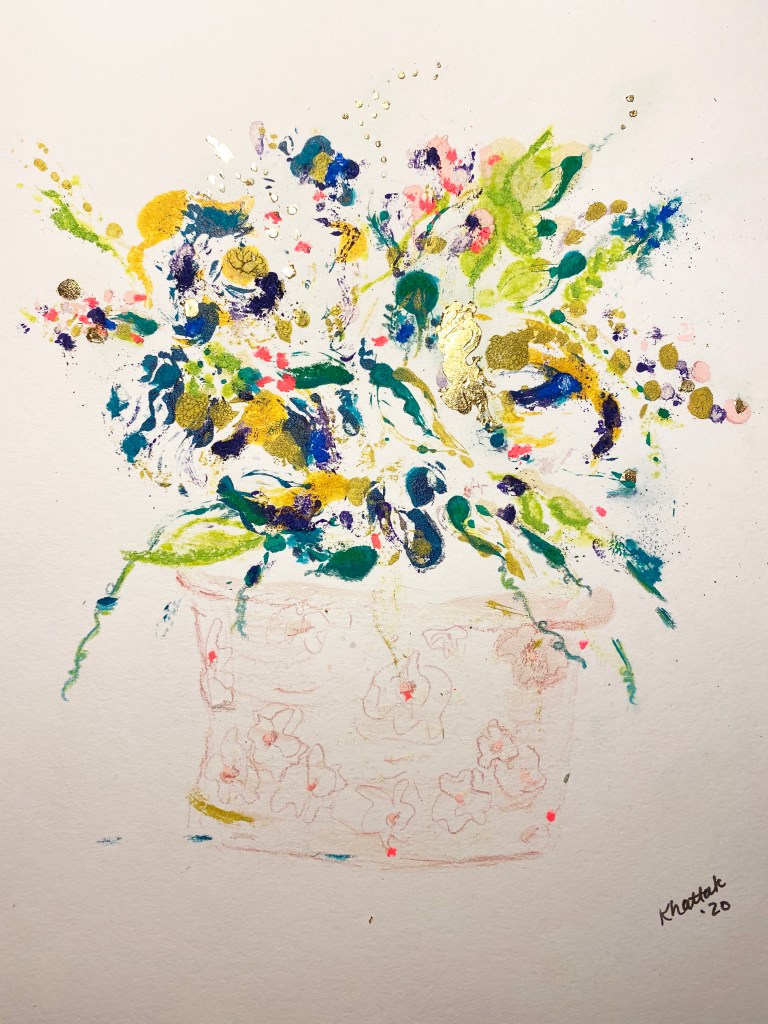
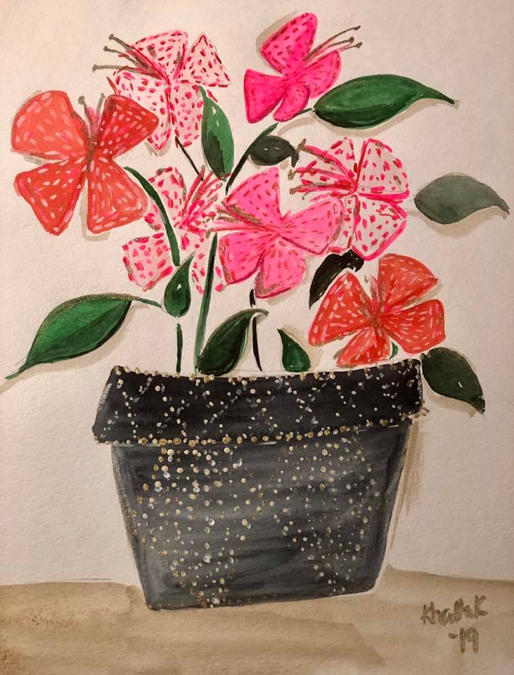
“Flower Power” by Stephanie Khattak. Acrylic Gouache, Watercolor and Metallic Drawing Ink on Paper. 2019.
I don’t paint many still lifes (still lives?), preferring instead the gesture and movement of figurative drawings. But I’ve noticed that every six months or so, my style and preferences evolve a bit. I wouldn’t say they ‘level up,’ because that means that one is better than the other, or that I enjoy painting one more, and other than improving as an artist, there’s not that much of a change. Maybe a better phrase is “level across.”
This potted plant isn’t found in nature. I started it because I had some new paints I wanted to test out. (Holbein Acryla Gouache.) I do like the way it turned out, though. I enjoyed filling in the pattern, and the flowers remind me of butterflies!
This post contains an affiliate link, so I earn commission on any purchase. This doesn’t affect my content and I only link to products and vendors that I trust.
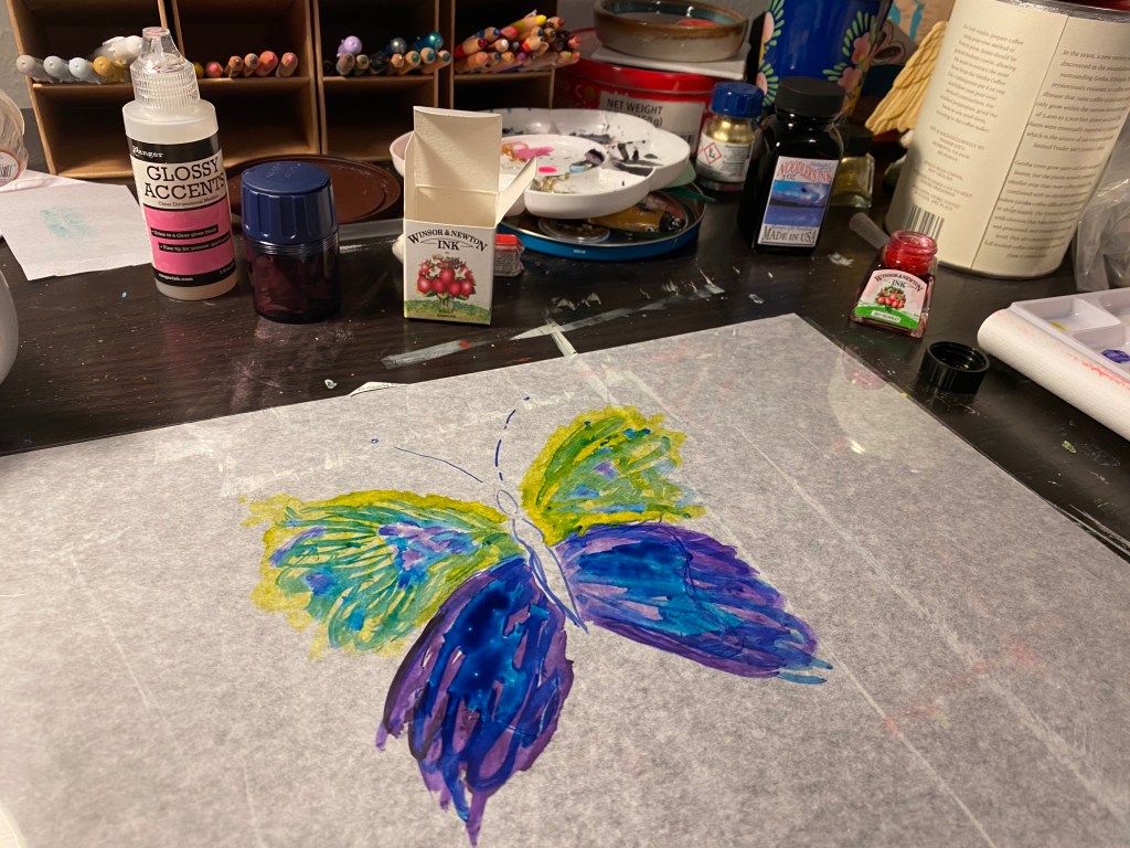
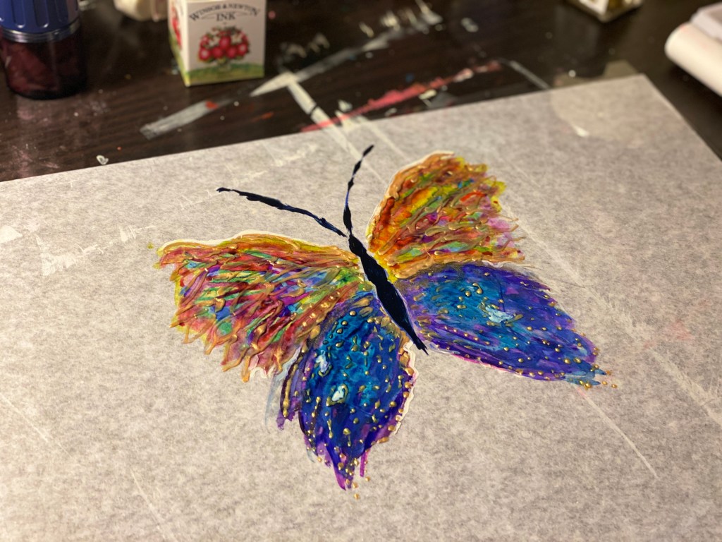
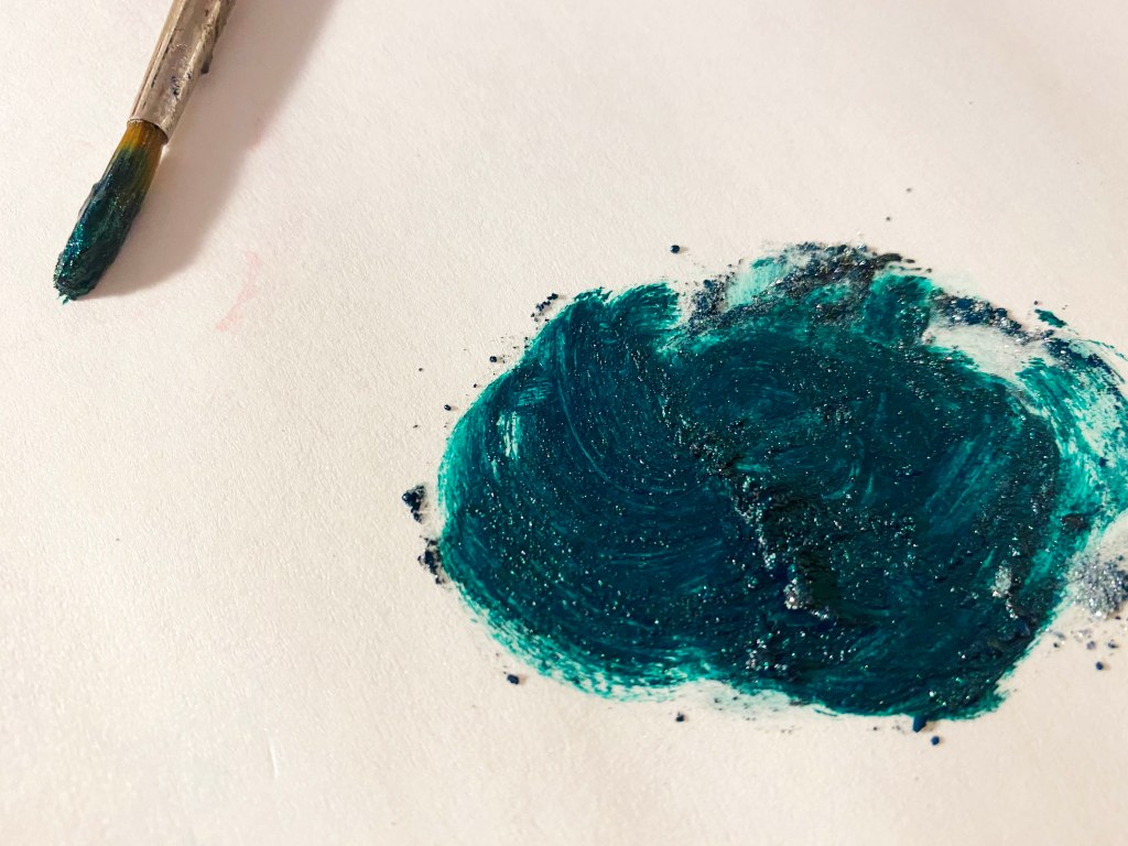
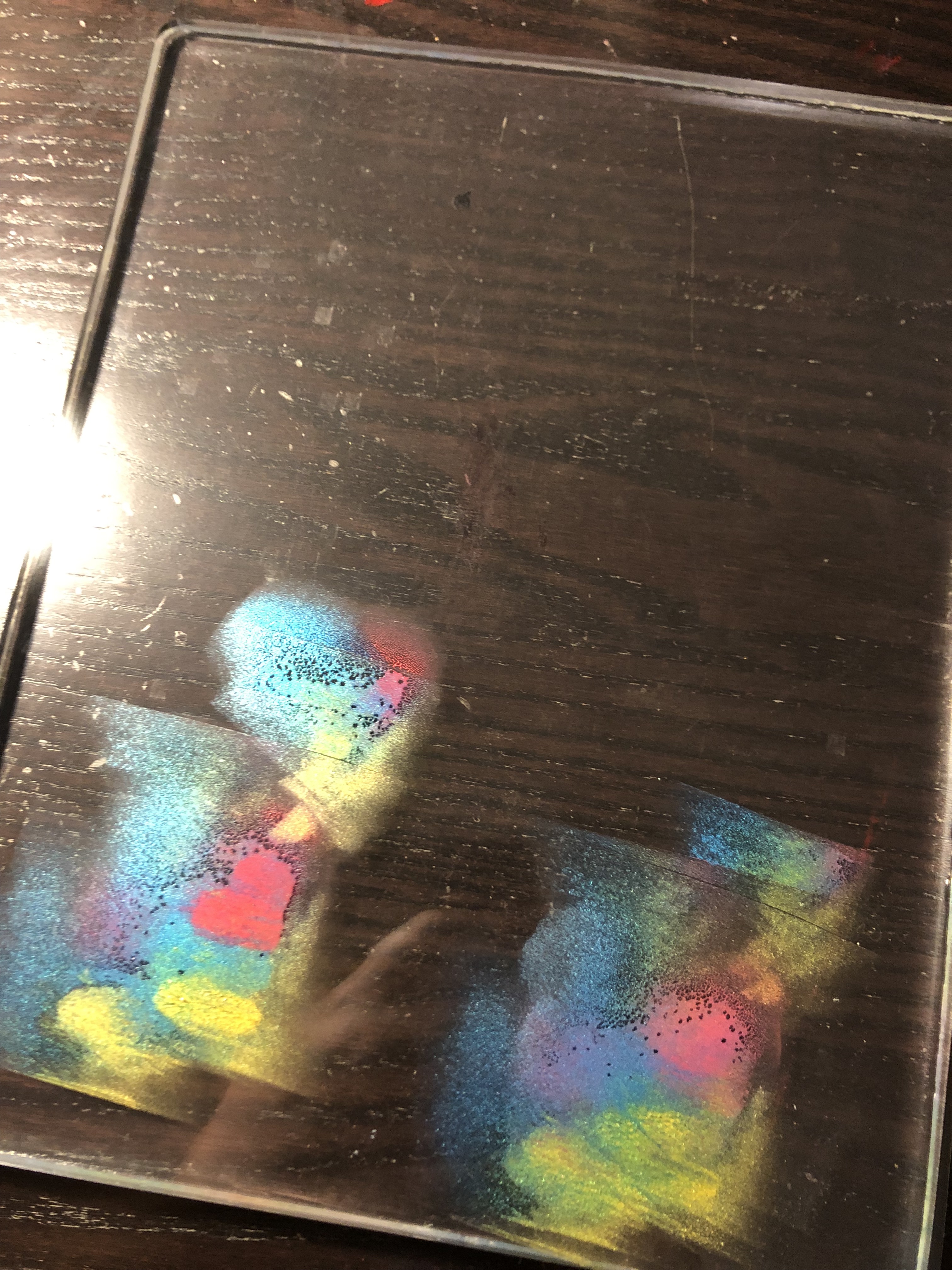
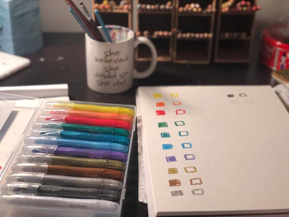
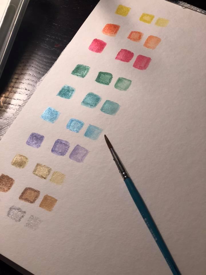
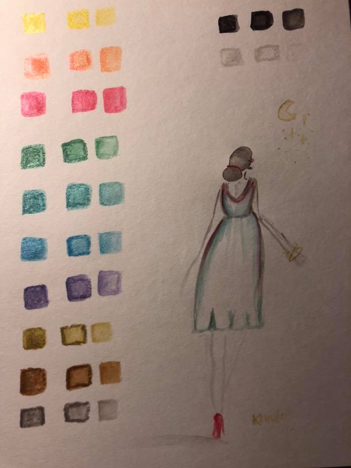
Trying some fun new supplies this week! They’re metallic Brea Reese Watercolor Creams, a water soluble medium similar to oil pastels. I found them at Target here in Dallas.
The first swatch is an
opaque square that I colored in and then painted over. The middle square
is an opaque frame that I painted over and used the remaining color on
my brush to fill in the middle. The third square is just color that my
brush picked up from the other swatches, for a watercolor effect.
The figure was painted by loading color onto a wet brush directly from the stick.
These are pretty cool and while there are higher end items that are similar (Caran D’ache Neocolor II) these are the first metallic options I’ve seen. This was just one of several new items I saw in Target’s art supply aisle. I love that cool supplies like these are becoming more accessible in price and location, and that the quality is good! The more people are able to make art, the more art we will have in the world!