Posca Marker Print

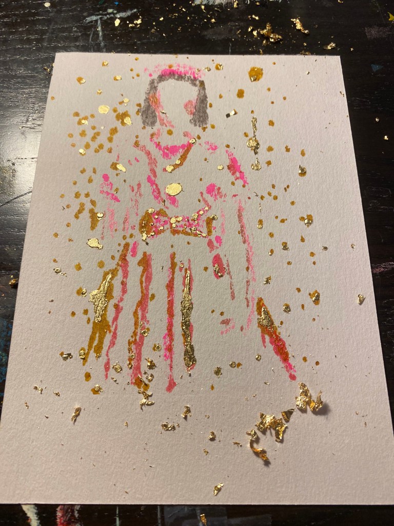
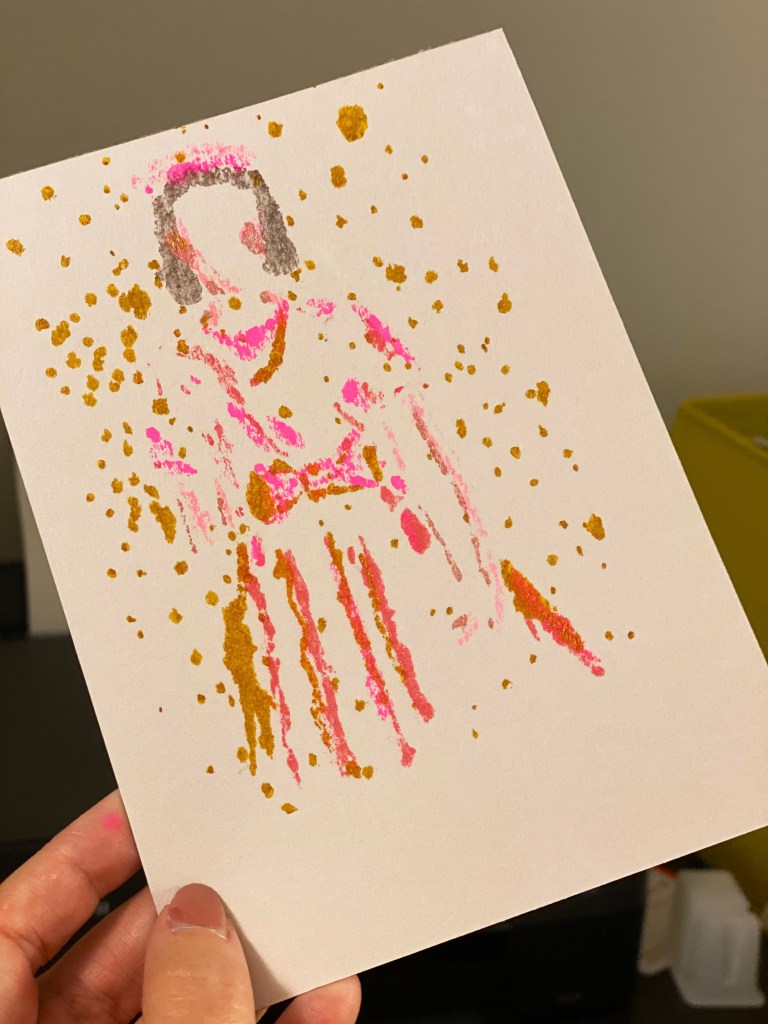
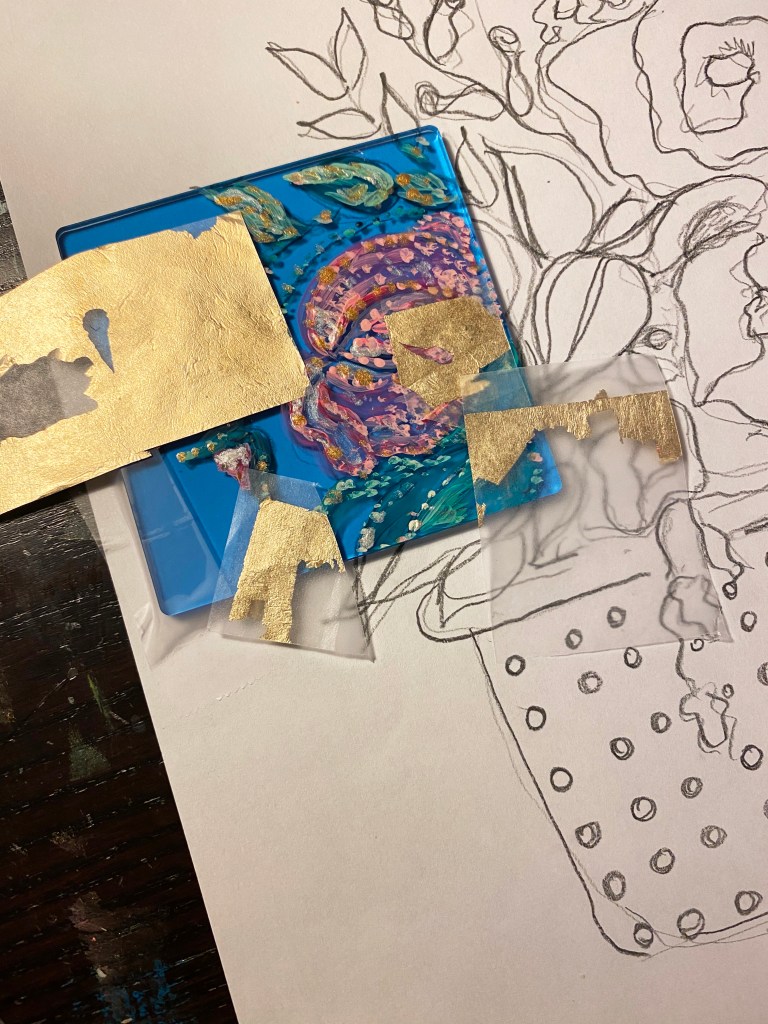
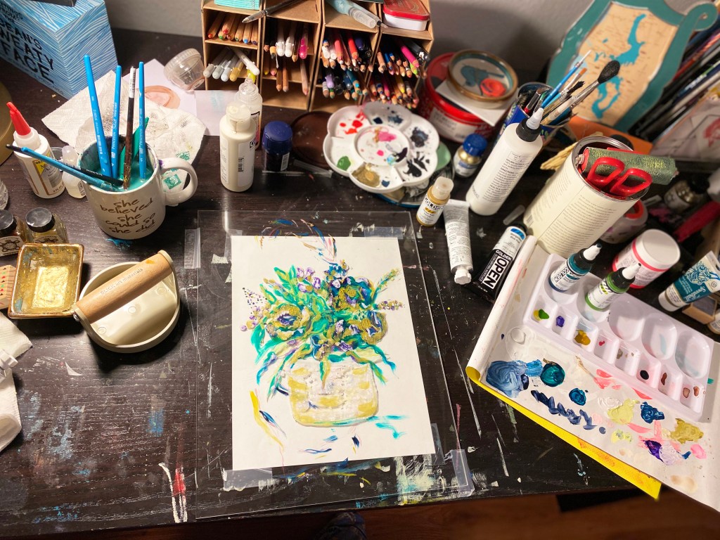
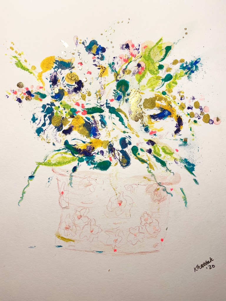
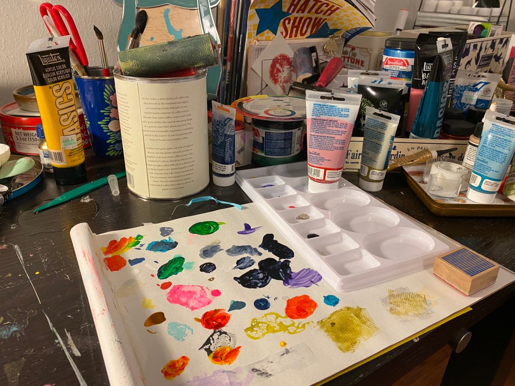
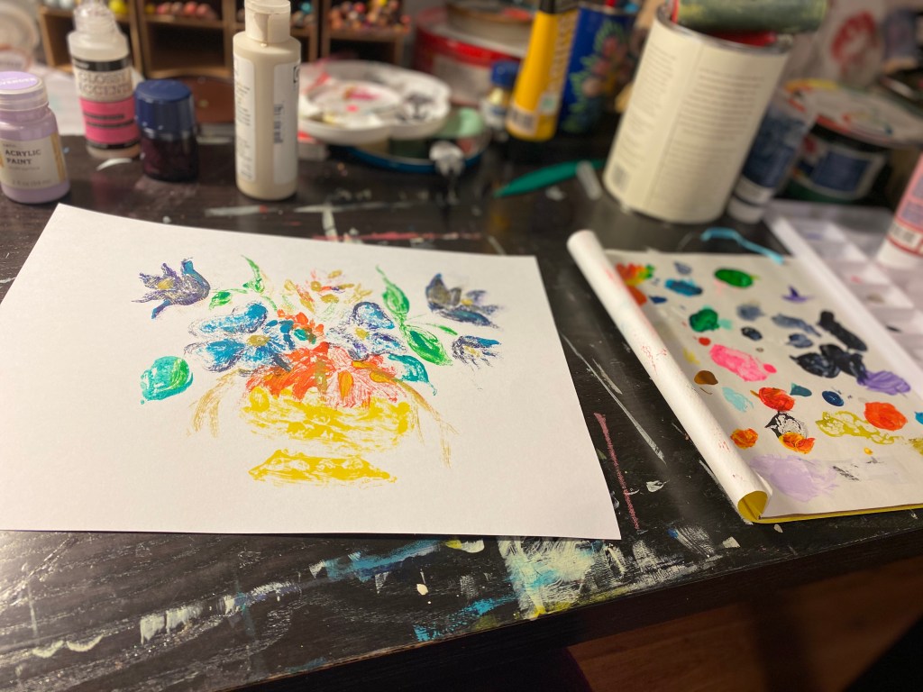
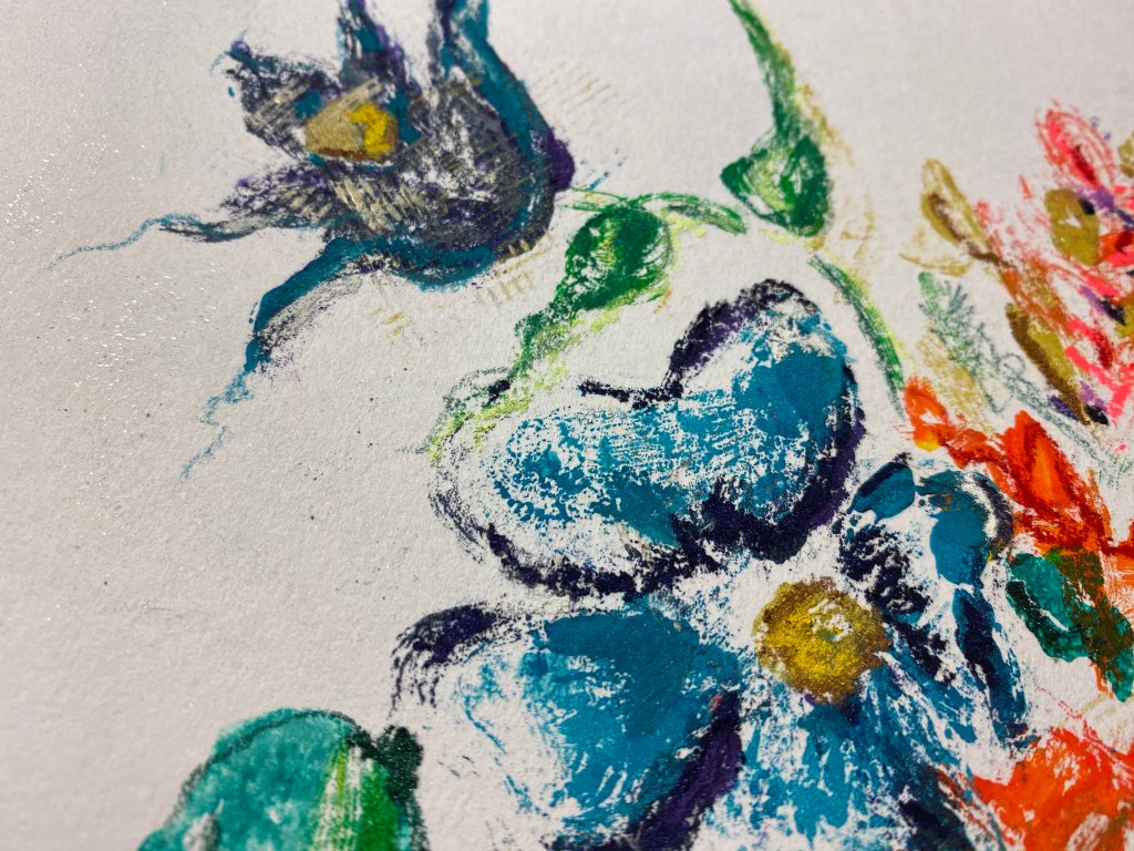
As I continue to experiment with print processes, I have enjoyed trying out new items to use for plates and printing material. This print was made using Uni Posca markers on Grafix Dura-lar. Using the same process as my plexiglass prints, I placed a source image under the Dura-lar, then drew over it with the Posca markers. I think it worked well, came out a little lighter than the other method but it is fun to be able to mix up the look of the art. I did have to work faster, as the markers dry a bit faster than acrylic or printing ink. This method is great for quicker projects when you want to do something creative or try an idea without making a mess, having to take out a lot of supplies, or using a full sheet of plexiglass. The Dura-lar is also easy to cut to size, making it an affordable option for smaller prints.

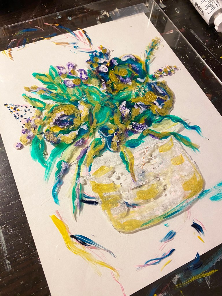
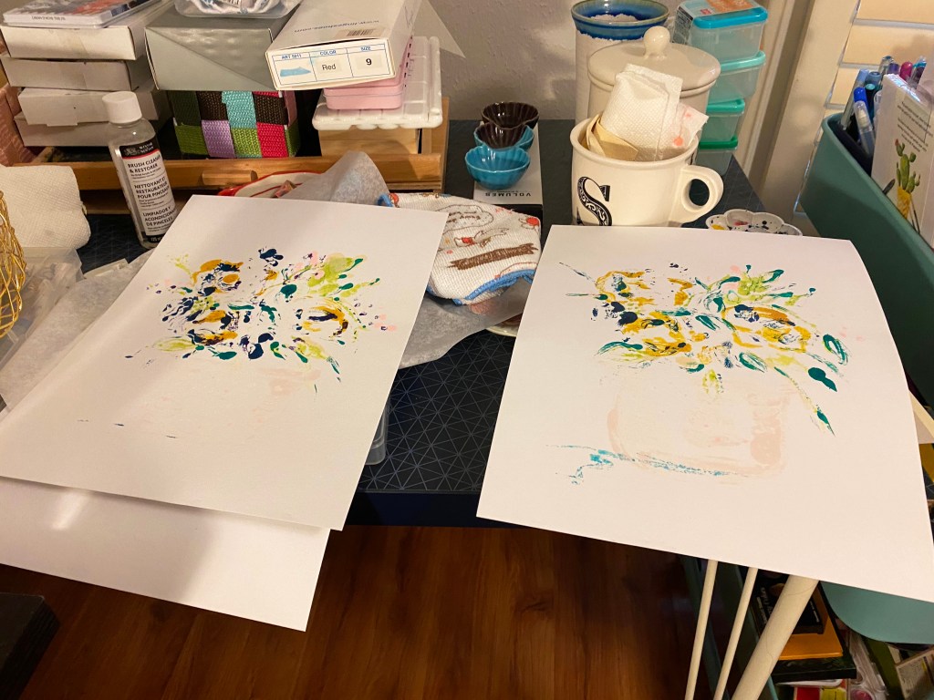
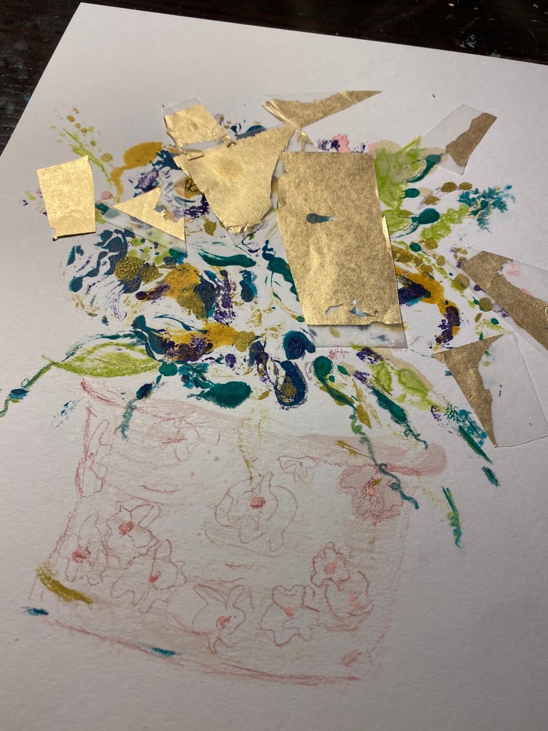
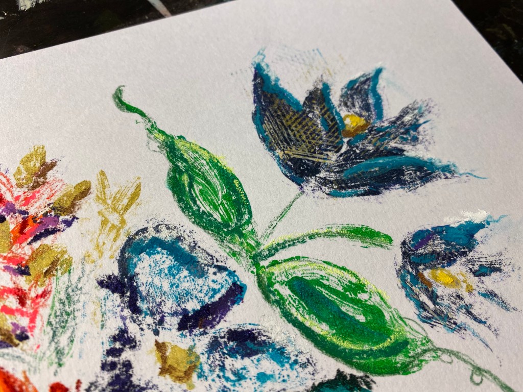
I focused on the figure in this print, as I felt the marker would be too light to make a background look good. Instead, I used a dot pattern for some extra visual interest.

Of course, I embellished it with gold leaf at the end.

Monoprint using Grafix Dura-lar and Posca Markers by Stephanie Khattak.

Some works in progress

More printmaking experiments! These are Posca marker on Dura-lar. It’s a different look than the paint on plexiglass, but same process. This was a nice alternative for a quick visit to my studio when I didn’t have the time or focus to get out my paints/inks or work from a large plate. I still have some extras to add, but in general, I like the direction they’re headed.

Relational Abstraction

“I have been continuously aware that in painting, I am always dealing with… a relational structure. Which in turn makes permission ‘to be abstract’ no problem at all.”
Robert Motherwell

This is another plexiglass print based off an old family photo. Pictures don’t do it justice, but I am still comfortable and happy with the idea that the abstraction is a bonus, if not the entire point. With that in mind, when I embellish the pieces (this time with Posca markers) I try to do so using texture or pattern versus filling in the blank spots or going over the lines to make them look more real.

I like this Motherwell quote and feel that it does a good job of summarizing what I’m doing with this art project. Relational structure vs. a copy or exact representation. In this print, for instance, the way the two figures relate to each other and the lilac sky’s relationship to the gold grass are the important parts of the work. The colors invoke not only the vintage photograph source material, but also a very specific type of “magic hour” that you get in East Texas, when the light is warm, soft and golden. The figures, my mother and uncle, are dressed up and posed in their Sunday best, the clothing and details are abstract, but I believe their relationship to each other and the moment is captured pretty well. (If I say so myself, haha!)

Printed Family Portraits

As I get older and time passes, I am always exploring ways to use art to communicate and share my East Texas roots and young adulthood. I write about some of this in my occasional Pine Curtain Stories project, but have also been thinking of ways to make art around the theme that is a little less illustrative. But I am not a portraitist or skilled in realistic painting , and I want to keep some of the figurative/narrative theme.

Since I have so enjoyed my recent plexiglass printmaking, I decided to expand that work to make abstract prints of family photographs. The first one is of my grandfather and uncle, sometime in the 1960s. It’s a work in progress, as I still need to do some embellishing.

I love making these, and using family and community images gives the work a deeper purpose. I also like this type of printmaking, because the final result is nothing like the original guide piece. It comes out more blurry in some ways, brighter in others. Fitting for such memories.

Plexiglass plate over a copied photo. I add the color one layer/spot at a time and quickly pull two prints, touching up the paint a little in between.
Background prints.
Print process complete. Next step will be to add some finishing touches with pastel and ink.

Embellished Vintage Art

I welcomed two kittens into my home (more on that later!) and adjusting with them has meant a little more time away from my studio, where there are many oil sticks to eat, soft pastels for kitty paws to crumble and gold leaf to stick to whiskers. (Yes, kitten-proofing the studio is at the top of my to-do list!)

So, I have been working digitally for the past few weeks, and some of my new favorite art to make is embellishing old photos from various library and public domain archives. These performers are from the New York Public Library digital collection.

All updated images embellished by Stephanie Khattak using iPad Pro and Procreate.

Painting on Blue Plexiglass

I ordered a few colored plexiglass squares to experiment with. Since they’re so small, instead of printing with them, I just embellished them with acrylic and gold leaf. I ordered this blue color, a hot pink transparent and an opaque red. I really like the effect!

The guide is a heavy pencil drawing that I used for painting and printing the larger pieces. I am hoping to get multiple uses out of these, especially being able to focus in on details for smaller pieces.

Acrylic on Blue Transparent Plexiglass, by Stephanie Khattak.
Acrylic and Gold Leaf on Blue Transparent Plexiglass, by Stephanie Khattak.

Plexiglass Monoprint

I really enjoy these plexiglass prints, because it’s a great exercise in letting go and getting into the process without worrying about the outcome. As you can see, the plate doesn’t look much like the print at all. Part of the fun is filling in the abstract shape with pastels, and even gold leaf! I purposefully don’t try and make it look like what’s on the plate. Instead, I simply go where it leads.

Usually, I get two prints from a plate like this, lightly re-inking after each one as the paint does dry quickly. (I use a mix of block printing inks and acrylics and they both work fine.)

Initially, I had planned to wash and reuse the plates, but I find that I like the effect of the paint/ink on the plexiglass. Plexiglass is pretty inexpensive, so I will just keep it as another art piece.

I’m considering opening up for sales again later this summer. These would be hard to sell as originals because the pastel powder is hard to control, thus hard to ship. But maybe I could work them into an embellished print (fine art print) series. We will see.