Outside of the Beauty Shop

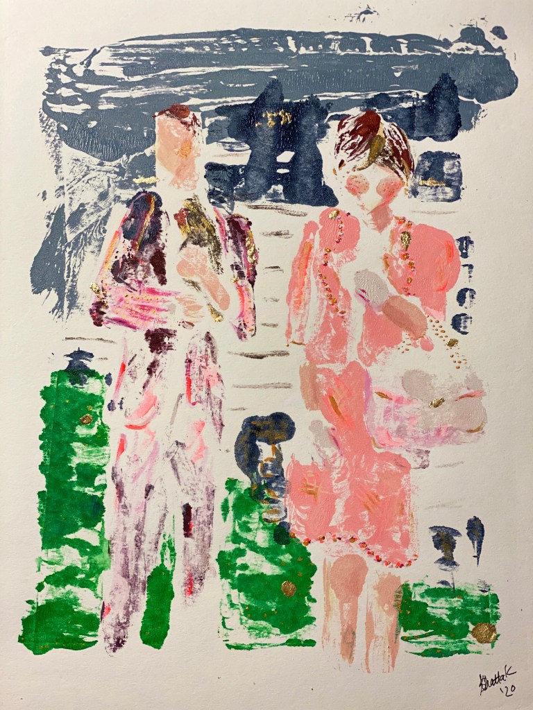
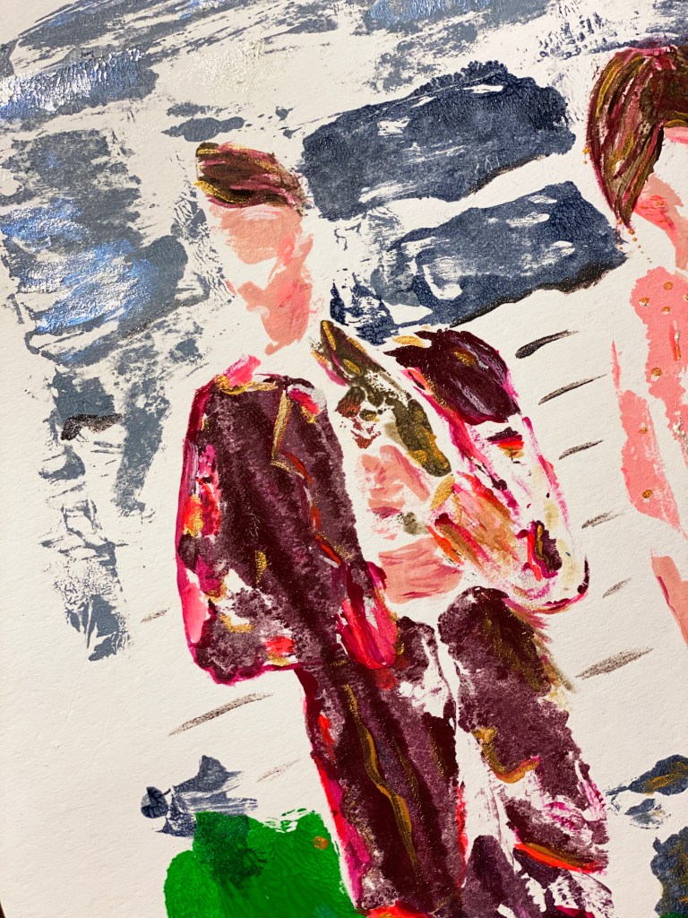
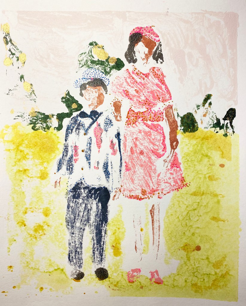
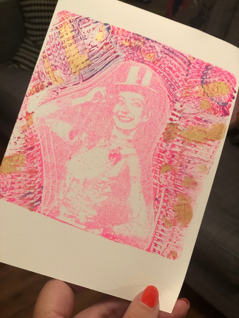
These are the final prints from the third piece in my Pine Curtain Stories project. They feature my father and my aunt, most likely in the 1960s. They’re standing outside my grandmother’s beauty shop, a business addition to their home.

My favorite parts of these prints are my aunt’s pink purse and the dog that my dad is holding, a chihuahua named Pinky who lived long enough to emerge from under my grandmother’s couch and glower at me when I was a baby in the 70s. With the styling of the print, this Pinky looks more like Poncho, a long-haired chihuahua who my dad is probably at home holding right now.

There are subtle differences in the print, and I only added gold leaf to one. The other, I “shined up” with metallic, iridescent and inference acrylics.

“Outside the Beauty Shop, 1/2” by Stephanie Khattak.
“Outside the Beauty Shop, 2/2” by Stephanie Khattak.
Detail shot of dog.

Some works in progress

More printmaking experiments! These are Posca marker on Dura-lar. It’s a different look than the paint on plexiglass, but same process. This was a nice alternative for a quick visit to my studio when I didn’t have the time or focus to get out my paints/inks or work from a large plate. I still have some extras to add, but in general, I like the direction they’re headed.

Relational Abstraction

“I have been continuously aware that in painting, I am always dealing with… a relational structure. Which in turn makes permission ‘to be abstract’ no problem at all.”
Robert Motherwell

This is another plexiglass print based off an old family photo. Pictures don’t do it justice, but I am still comfortable and happy with the idea that the abstraction is a bonus, if not the entire point. With that in mind, when I embellish the pieces (this time with Posca markers) I try to do so using texture or pattern versus filling in the blank spots or going over the lines to make them look more real.

I like this Motherwell quote and feel that it does a good job of summarizing what I’m doing with this art project. Relational structure vs. a copy or exact representation. In this print, for instance, the way the two figures relate to each other and the lilac sky’s relationship to the gold grass are the important parts of the work. The colors invoke not only the vintage photograph source material, but also a very specific type of “magic hour” that you get in East Texas, when the light is warm, soft and golden. The figures, my mother and uncle, are dressed up and posed in their Sunday best, the clothing and details are abstract, but I believe their relationship to each other and the moment is captured pretty well. (If I say so myself, haha!)

Printed Family Portraits

As I get older and time passes, I am always exploring ways to use art to communicate and share my East Texas roots and young adulthood. I write about some of this in my occasional Pine Curtain Stories project, but have also been thinking of ways to make art around the theme that is a little less illustrative. But I am not a portraitist or skilled in realistic painting , and I want to keep some of the figurative/narrative theme.

Since I have so enjoyed my recent plexiglass printmaking, I decided to expand that work to make abstract prints of family photographs. The first one is of my grandfather and uncle, sometime in the 1960s. It’s a work in progress, as I still need to do some embellishing.

I love making these, and using family and community images gives the work a deeper purpose. I also like this type of printmaking, because the final result is nothing like the original guide piece. It comes out more blurry in some ways, brighter in others. Fitting for such memories.

Plexiglass plate over a copied photo. I add the color one layer/spot at a time and quickly pull two prints, touching up the paint a little in between.
Background prints.
Print process complete. Next step will be to add some finishing touches with pastel and ink.

Plexiglass Monoprint

I really enjoy these plexiglass prints, because it’s a great exercise in letting go and getting into the process without worrying about the outcome. As you can see, the plate doesn’t look much like the print at all. Part of the fun is filling in the abstract shape with pastels, and even gold leaf! I purposefully don’t try and make it look like what’s on the plate. Instead, I simply go where it leads.

Usually, I get two prints from a plate like this, lightly re-inking after each one as the paint does dry quickly. (I use a mix of block printing inks and acrylics and they both work fine.)

Initially, I had planned to wash and reuse the plates, but I find that I like the effect of the paint/ink on the plexiglass. Plexiglass is pretty inexpensive, so I will just keep it as another art piece.

I’m considering opening up for sales again later this summer. These would be hard to sell as originals because the pastel powder is hard to control, thus hard to ship. But maybe I could work them into an embellished print (fine art print) series. We will see.

More Abstract Gel Printing

I’m really enjoying making these prints, not only the process (pulling the paper up is so satisfying!) but seeing where it can go adding different types of media and techniques.

I admit that I have not really been called to abstract art. I enjoy looking at it – my favorites are Larry Poons, Helen Frankenthaler and Gunther Fjorg. And, I’m crazy about them, but the list is pretty short after that. But, I also admit that I’m not the best at drawing, so I get frustrated when what’s on the page doesn’t match what’s in my head.

In loosening up my notions of what I do and don’t like and trying more abstract pieces, I have learned that I enjoy making color combinations, marks and other abstract techniques while I work over the more figurative stuff to get it just right.

In other words, where art is concerned, never say never and rule nothing out.


I am also experimenting with adding other types of art techniques and media to the page, incorporating Gel Pen details:

Acrylic, block ink, gel pen and gold leaf Gel print by Stephanie Khattak.

And Gold Leaf:


As is my process to avoid wasting products, I pulled a second print that came out with much lighter ink. To add interest here, I incorporated a portrait.


We will see where it takes me next.


“The courage to imagine the otherwise is our greatest resource, adding color and suspense to all our life.” – Daniel J. Boorstin